2023

Background
In 2023, I redesigned the user interface for Tiny Comet's educational game Nation RPG. The project focused on making American history accessible and engaging for young students on Roblox. By simplifying complex educational concepts through intuitive design, the revamped interface significantly improved the learning experience. The project was successfully delivered within 2 months, receiving positive feedback from both the player base and development team
The game can be found here.
Problem
I was brought in to reimagine Nation's interface, which was struggling to communicate core gameplay elements to young students. My focus was to make settlement management more intuitive for the target audience.

While the majority of this interface was nice, it faced several major issues:
The top settlement display confuses players by suggesting combat gameplay, similar to battle-focused Roblox games, rather than communicating the core settlement-building experience.
Stats in the bottom-left create information overload and conflict with Roblox's mobile thumbstick placement.
The interface feels visually heavy and distracts from the educational experience.
Solution:
To solve the issues present with this design, I decided to first start out with creating a new layout for the wave informations. I liked how the previous design kept the settlement statistics on the top, so I thought of creating a bar to contain the information better. In one of my early explorations, I decided to make the settlement's health displayed by hearts, to add variety and less confuse the players. For statistics like hunger, housing, current wave number, and time, I decided to simply have a number displayed next to an icon.
As for the players individual stats, I decided to make the bars go above the player's hotbar to show the personability, as well as reduce experience from a bar to a simple token. Also, I decided to move the menu buttons from the left side next to the hotbar to leave more screen real-estate. Below is the image of my initial exploration.
Initial Exploration
As shown, this exploration already solved many of the issues present in the original one, and also saving a ton of space on the screen.
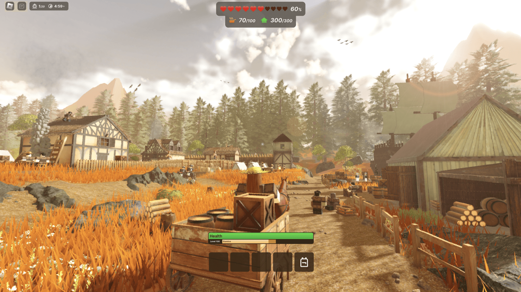
Going forward, I had to finally start on the design for this interface. As shown in the screenshots above, the game mostly takes part in an autumn setting, meaning the environment is very warm and orange. Due to this, I chose to have the UI based around a green color palette, having contrast but still giving off the natural vibes.
For fonts, I also decided to use a simple font: Inter. It provided enough weights and was versatile enough to be used in a project as large as this.
One of the issues with my initial layout exploration was how the top-bar bulged down for certain information. For me, this felt very unclean. Fortunately, I got inspiration from Apple's Dynamic Island, newly revealed at that time. I decided to have the smaller informations under the settlement health be in their own self-contained "island" all lined up next to eachother. Below is a picture of the final design.
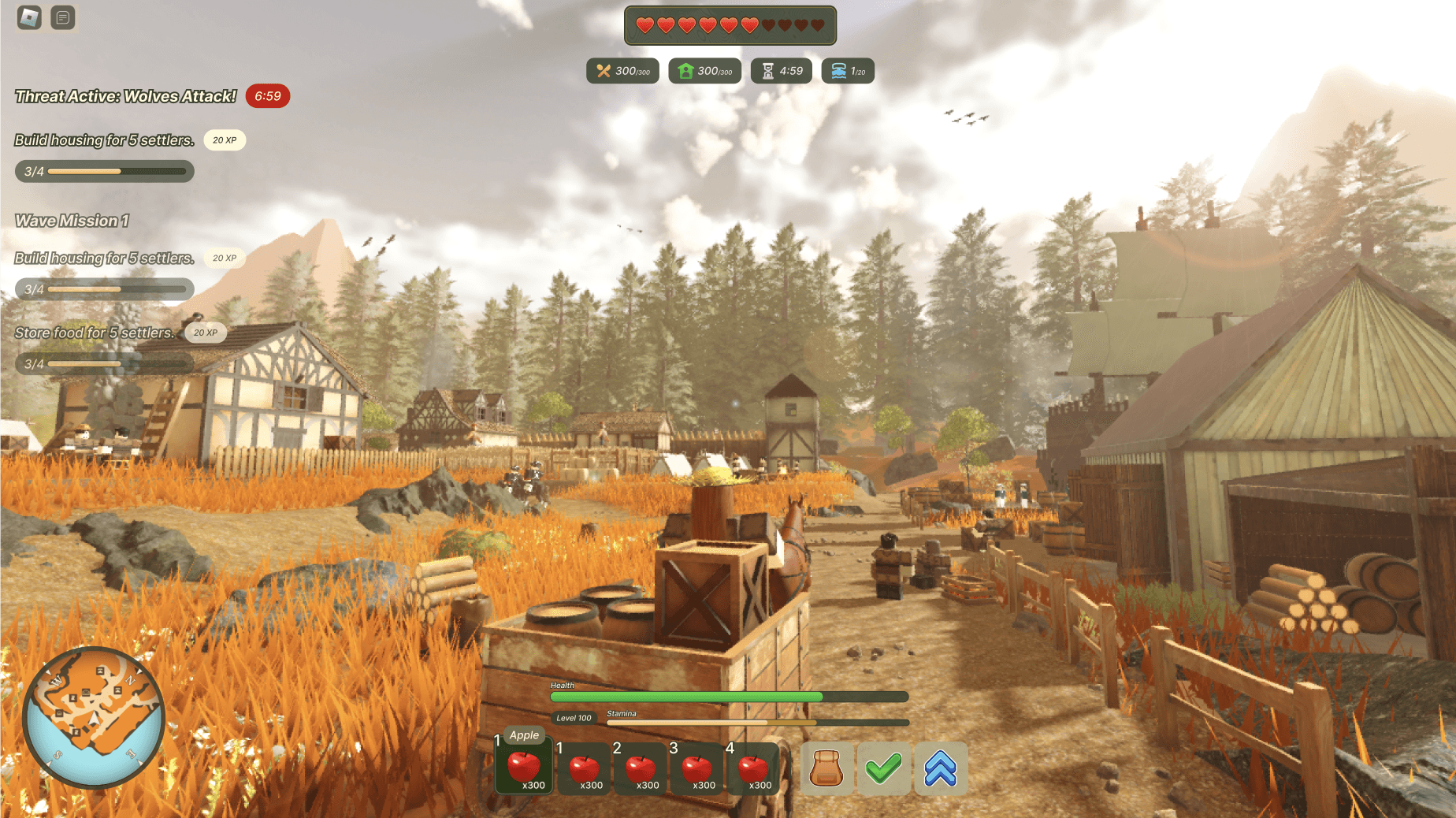
Final Result
Most of the icons present in this design were either hand-crafted, or from the Google Material library. One of the icons I'd like to specifically point out however is the one used for the wave counter. As this game is about raising a settlement, the wave counter was changed multiple times to be more stylized in this approach. At the start, it was a simple wave, however we wanted to do something more relevant to the game. As such, I created a ship icon based off the one in-game and we used it in production.
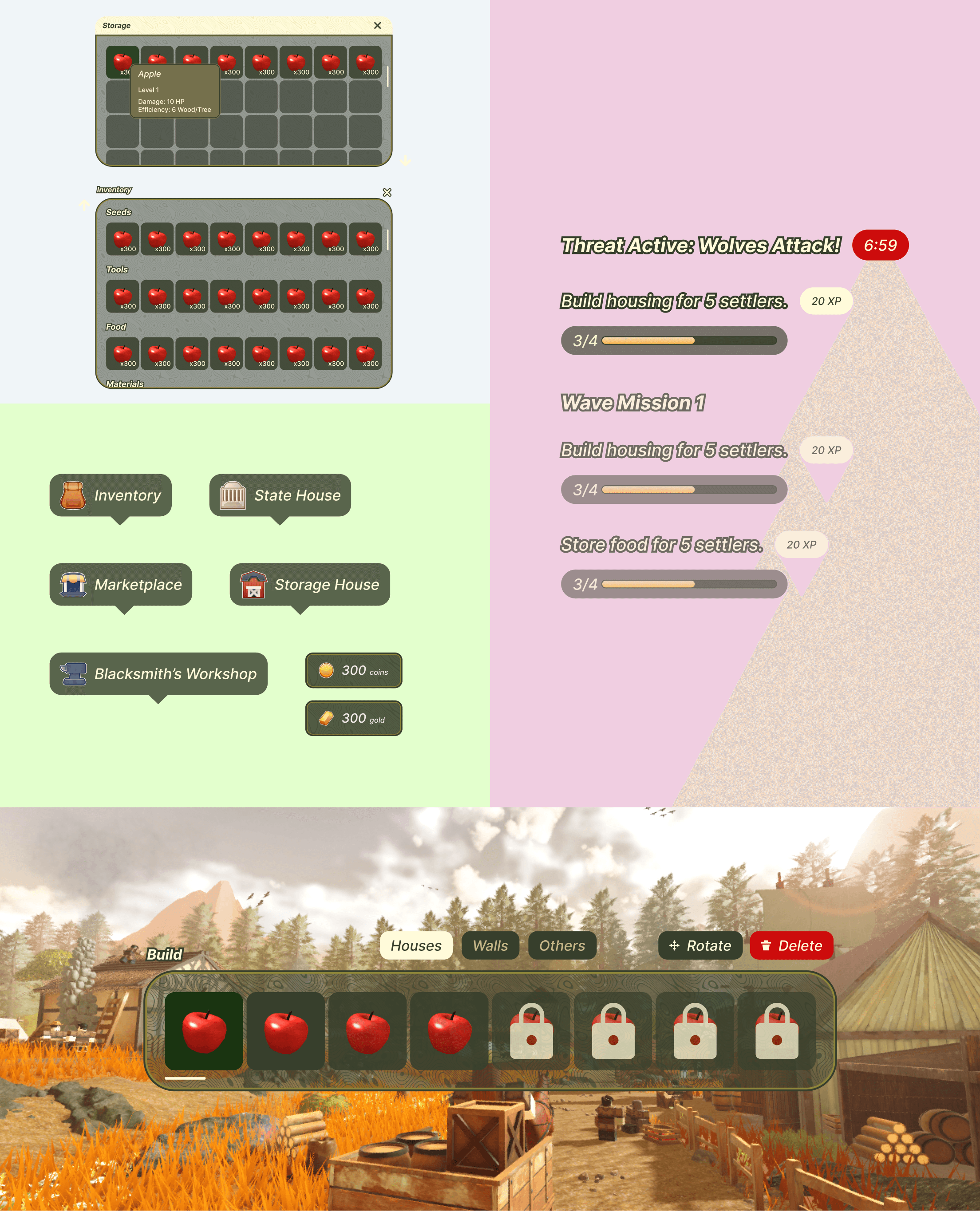
Showcase: Market Menu
In the old interface, the market menu required an excessive amount of clicks to buy or sell something. Below is an image of the old interface, and how I solved it in my solution.

Initial Design
Previously, when purchasing something in the market menu, a modal would pop up specifying the amount of units you'd want to purchase as well as its price. While this seems feature-full, imagine if you only wanted to purchase a singular quantity of one item? What if you had to go through this process for multiple items? It quickly becomes annoying, especially when pairing with how you have to swap between multiple categories to view different kind of items when the screen is almost empty. Below is a screenshot of how I dealt with these issues
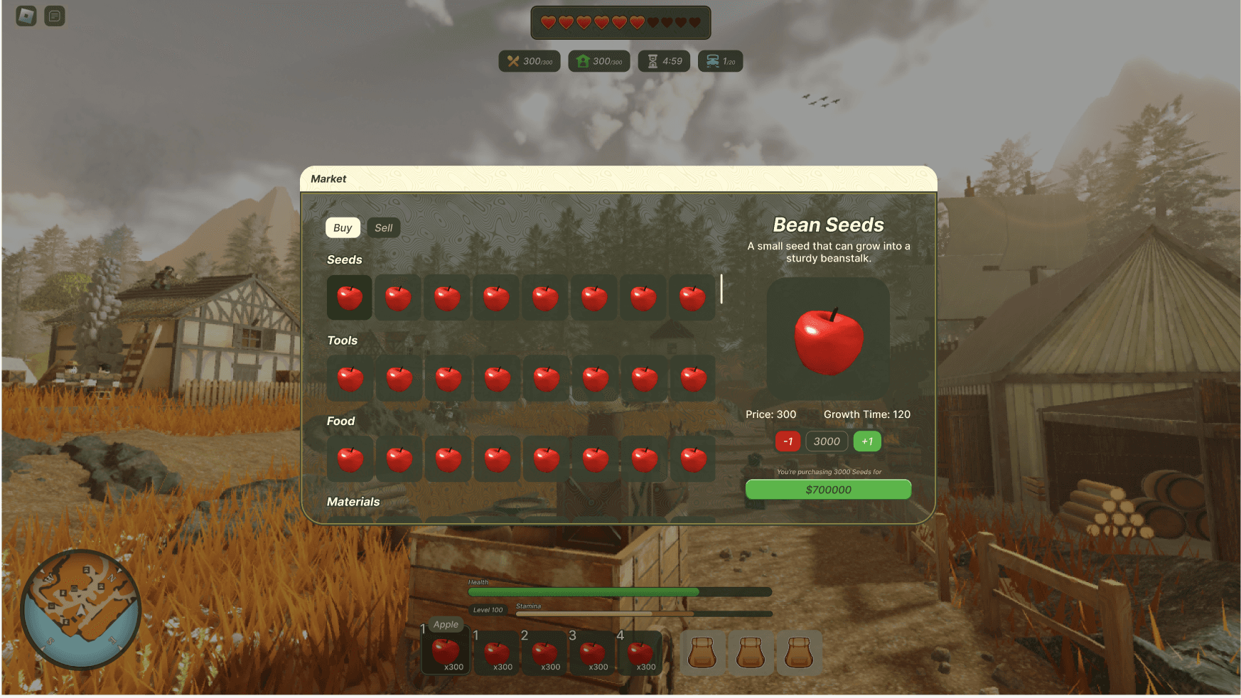
Final Outcome
The old design required too many clicks for basic transactions. I streamlined this by:
Bringing categories into a single view with clear headers
Adding direct +/- controls and quantity input
Implementing real-time price updates
Using translucent menus to maintain game visibility
Creating subtle visual hierarchies through color and gradients
Gallery


