2023
Background
In 2023, I designed the interface for Freeze Tag, a competitive take on the classic playground game. By focusing on clear visual feedback and strategic information display, the UI supported both competitive and casual play styles while maintaining readability during intense matches. The design successfully balanced rich gameplay data with clean visual hierarchy.
Problem
When I first started designing the UI for Freeze Tag, I went through many variations of comic-stylized themes. However, upon second thought it caused the design to be too heavy for actual competitive use and caused me to turn towards something more clean.
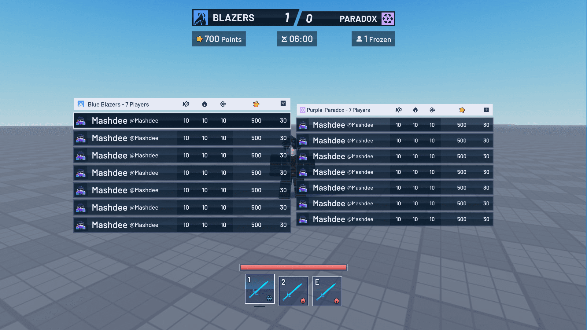
Initial Design V1

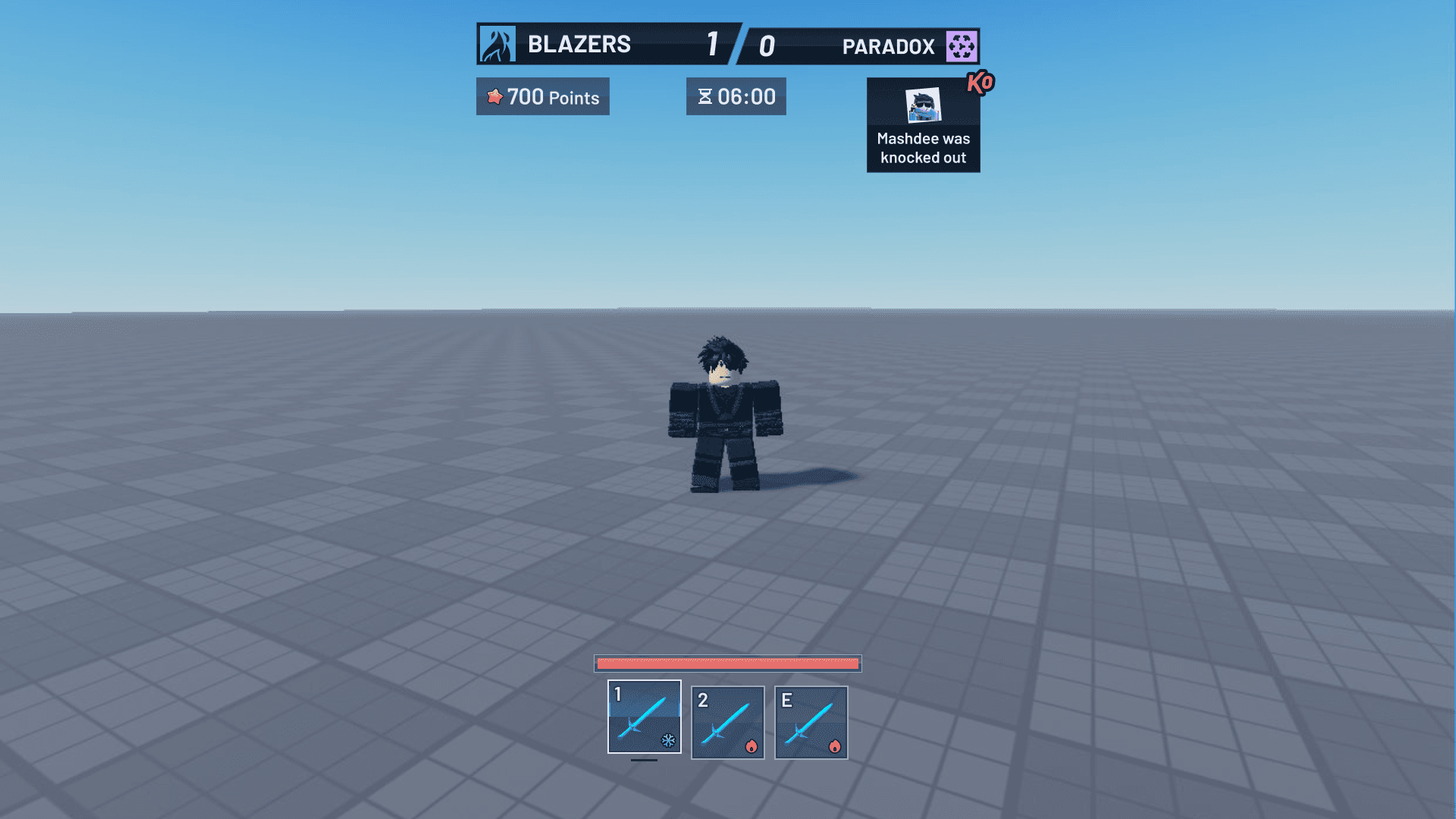
Initial Design V2
While the majority of this interface was nice, it faced several major issues:
The first version's comic-styled UI, while visually interesting, created too much visual noise with multiple floating elements and text overlays that could obstruct gameplay visibility.
The second version overcorrected by stripping away all personality, resulting in a generic scorebug that failed to convey the playful nature of Freeze Tag.
Both versions struggled with information hierarchy - V1 spread crucial information too far apart, while V2's minimalist approach made it difficult to quickly parse important game states.
Solution:
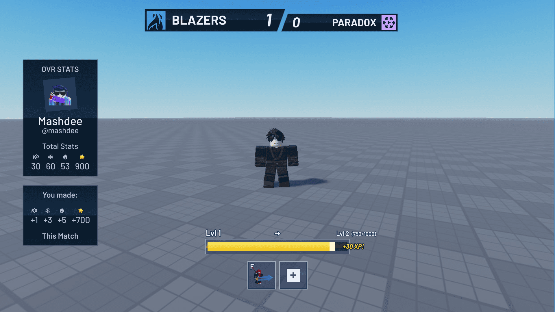
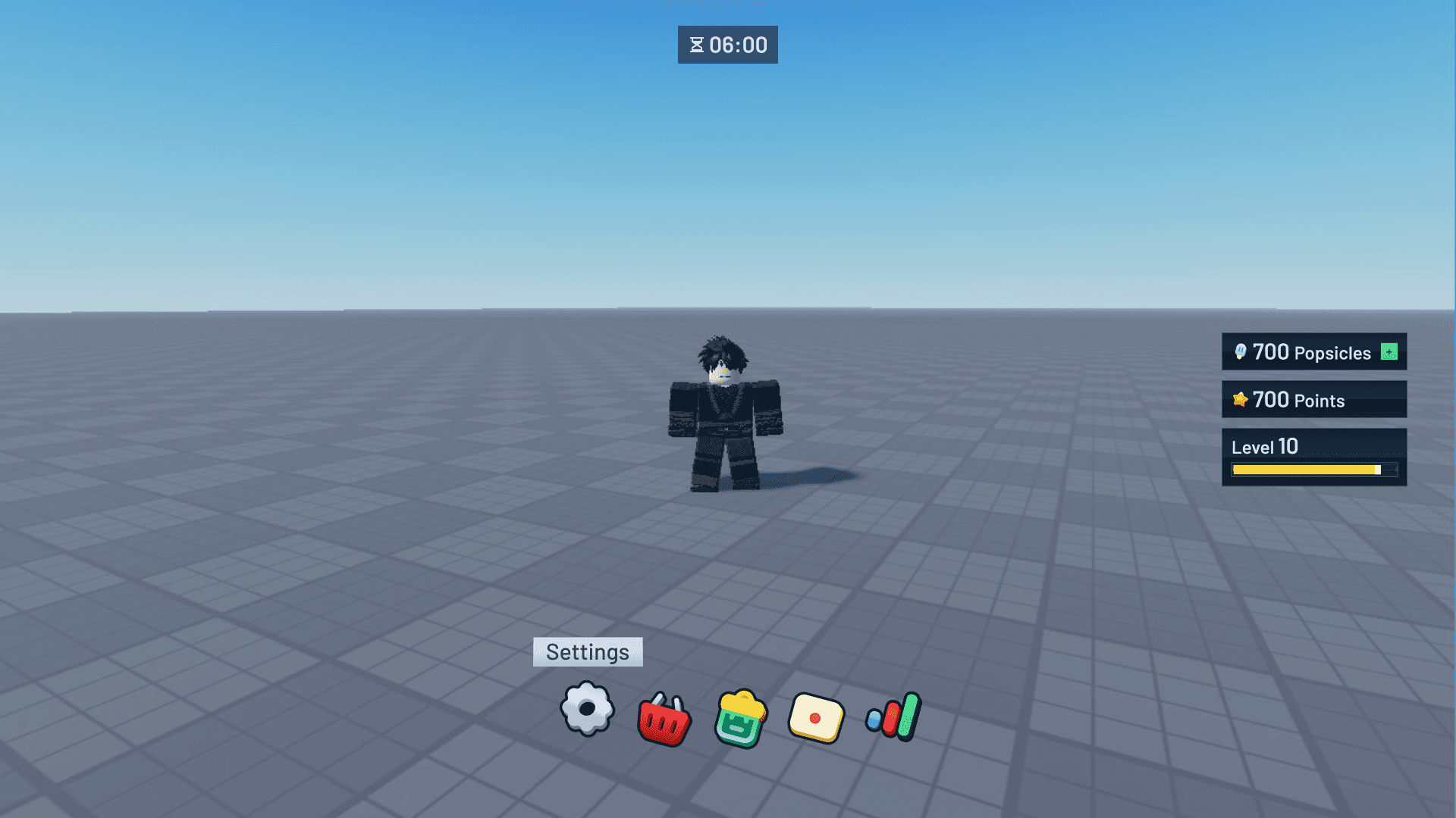
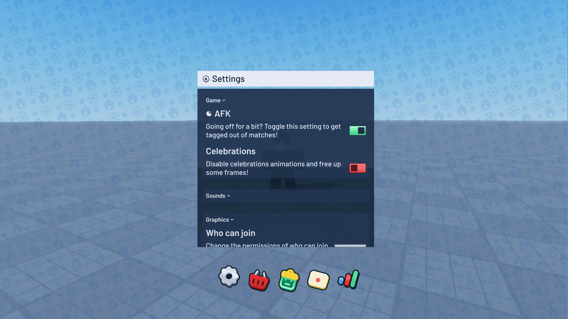
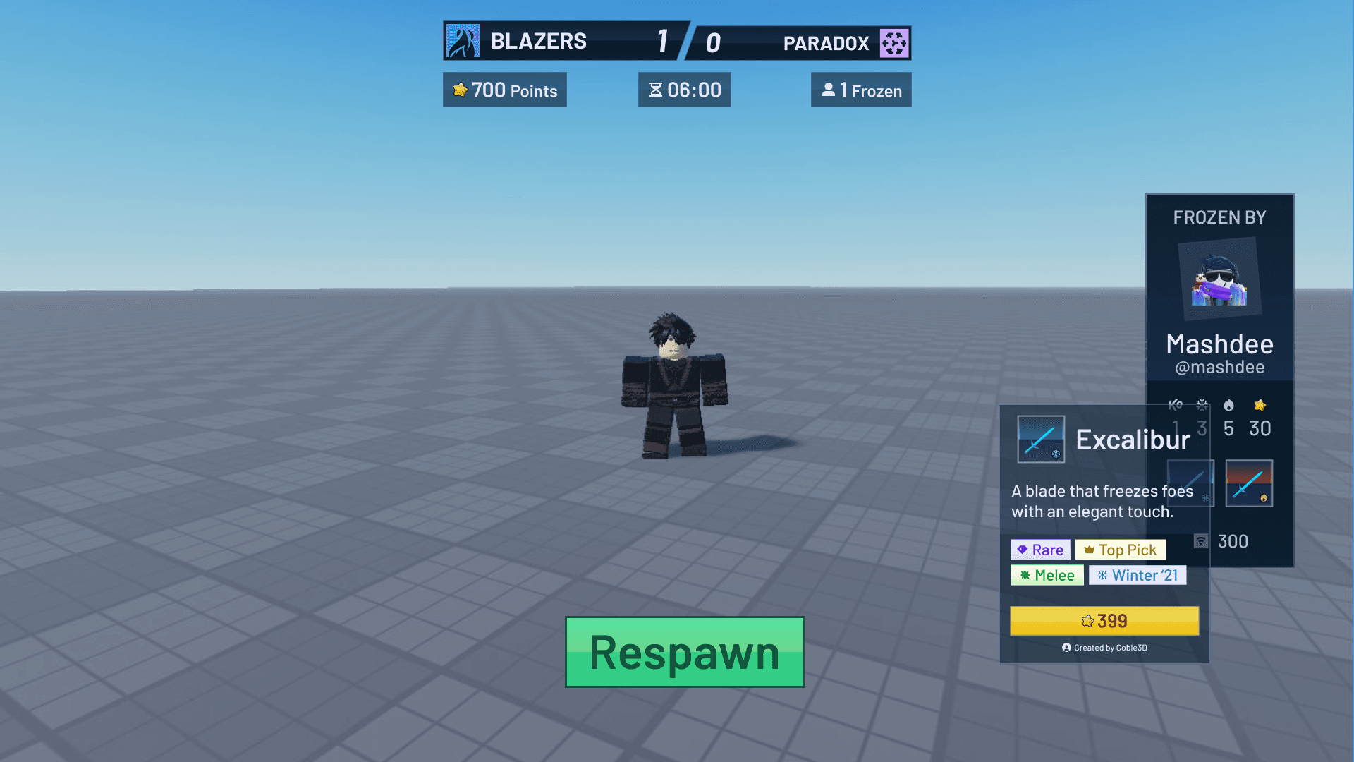
In the final design, I focused on creating a balanced competitive interface that maintains personality without sacrificing clarity. The scorebug now cleanly displays team identity through custom icons while grouping essential information (points, time, frozen players) in distinct, easily scannable modules. I introduced a dark container with subtle transparency to improve readability while keeping the game visible. The ability bar at the bottom uses clear iconography with cooldown indicators, making it easy to track during intense gameplay. The elimination feed uses stacked notifications with point values, adding excitement to successful plays while keeping the information compact and clear.

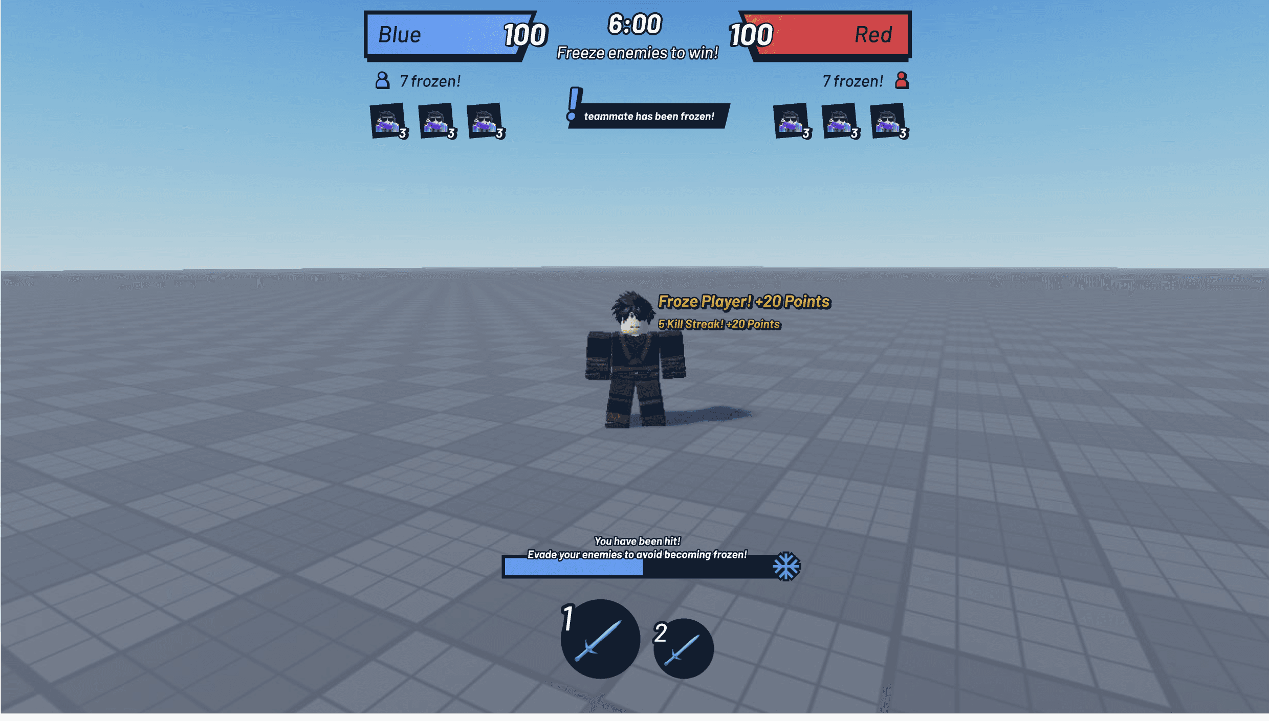
Final Design
As shown, this exploration already solved many of the issues present in the initial two versions, and also saves space by making the UI more modular and stackable.
I chose Barlow as the primary font for the scorebug and numerical elements due to its geometric nature. Its clean type work particularly well for scores and timers where quick glanceability is crucial.
The color palette draws from the game's freezing mechanic, using cool blues and frosted transparencies to reinforce the core gameplay theme. I implemented translucent dark containers with a subtle blue tint that not only improves text readability but also creates an "icy" effect that ties into the game's identity. The semi-transparent elements ensure crucial game information remains visible without blocking the player's view of the action. Status effects and team indicators use a carefully chosen contrast that maintains readability while feeling cohesive with the frozen theme.
Gallery